The problem with a famous view
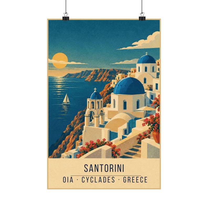
Photographs of Santorini tend to over-explain: every window, every step, every bougainvillea. A poster cannot do that and should not try. What survives the reduction is the geometry — the cubic white houses, the curve of a dome, and the enormous drop of the caldera behind them.
So the print leans on silhouette. The buildings are flat white shapes with hard edges, the domes are simple arcs, and the depth comes entirely from how the shapes overlap rather than from shading.
Where the blue comes from
The famous Santorini blue is not one blue. In the print it is split between the sea teal and the deep navy, which lets the domes sit forward of the water without a single gradient. That split is the oldest trick in screen printing: two flat tones read as depth where one tone reads as a sticker.
The cream does the heavy lifting for the whitewash. Pure white on a poster tends to glare and flatten; a warm cream reads as sunlit plaster and keeps the print in the same family as the rest of the collection.
Where it works on a wall
This is the coolest print in the set, so it does well on a white or pale grey wall where the navy can do the work. Bathrooms and bedrooms suit it — anywhere the blue is not competing with warm wood.
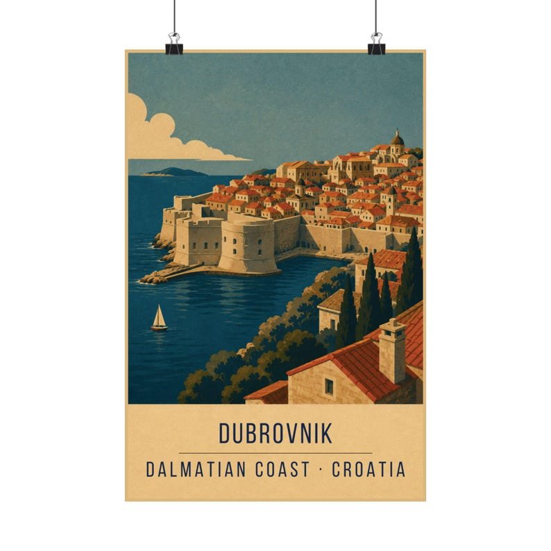
Hang it beside Dubrovnik if you want two Mediterranean coastlines that share a palette but not a mood: one is open and bright, the other is walled and stony.