The shape of the place
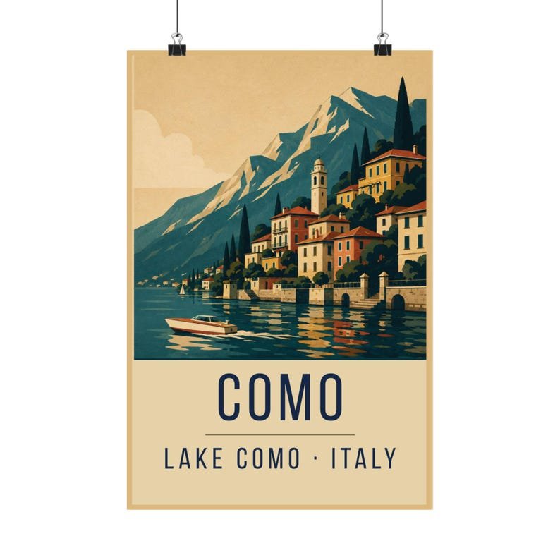
The lake runs in an inverted Y, and its western arm is the one most people picture: Bellagio at the fork, Varenna facing it across the water, and a road that clings to the rock the whole way down. From the water, the towns read as flat bands of colour stacked on a steep slope. There is almost no perspective to resolve — it is already a poster.
That is why the print keeps the horizon high and the water low. The eye travels down the mountain, across the rooftops, and lands on the boat. In the original railway posters this was standard practice: give the viewer one clear path through the image and one object to land on.
Five colours, no more
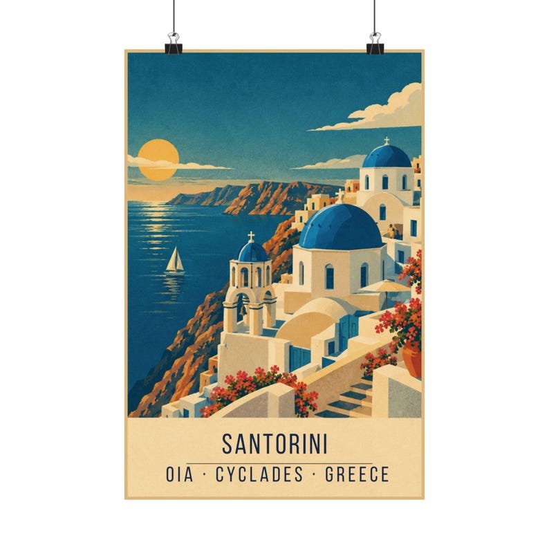
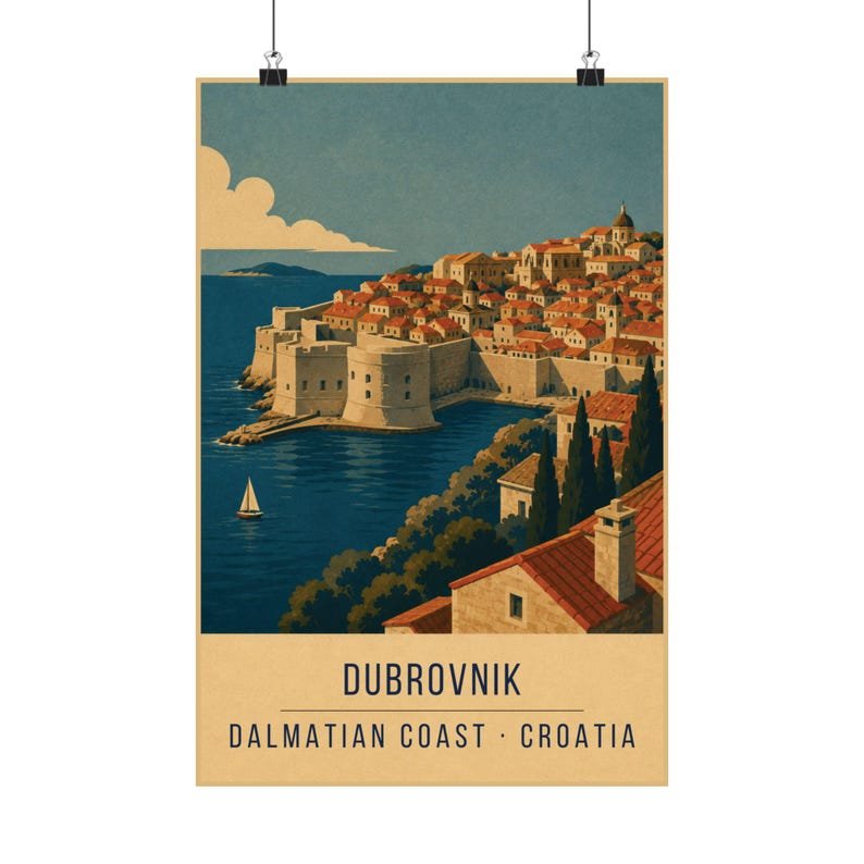
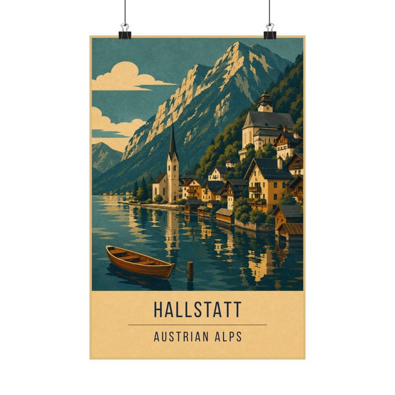
Every print in the shop uses the same five inks — a deep navy, a warm cream, a sea teal, a burnt terracotta and a signal mustard. On Como those inks fall naturally into place: navy for the mountain shadow, teal for the water, terracotta for the roof tiles, cream for the plaster, mustard for the light on the far ridge.
The restriction is the point. When you cannot reach for a sixth colour you have to solve the picture with shape and contrast instead, which is what gives the golden-age posters their punch. It also means a wall of these prints looks like it came from one press rather than seven different ones.
Where it works on a wall
Como is a warm print — the terracotta and mustard carry it — so it holds up against wood, brass and warm white walls. It works particularly well in a kitchen or dining room, where the boat and the water give people something to look at from a seated position.
If you are building a set, it pairs naturally with the Amalfi Coast print (same country, same warmth) or against Hallstatt for a cooler, alpine contrast.