The roofs are the subject
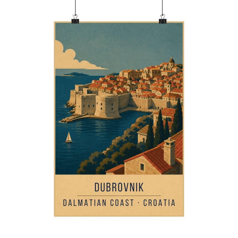
Seen from the walls or from Srđ above the city, Dubrovnik reads as one continuous terracotta surface broken by a few towers. That surface is the whole design. In the print it is handled as a single flat terracotta mass with the roof lines cut into it, rather than as hundreds of individual buildings.
This is how the old posters handled crowds, forests and cities alike — treat the mass as one shape, then cut just enough detail into it to tell the viewer what they are looking at.
Stone, sea and the problem of grey
Dubrovnik is a grey-and-orange city, and grey is not in the palette. The limestone is carried by the cream instead, warmed slightly by the surrounding colours, which is closer to how the stone actually looks in late afternoon than a true grey would be.
The Adriatic gets the teal, deepened to navy where it meets the rock. Keeping the water in two tones stops the sea from swallowing the bottom third of the poster.
Where it works on a wall
The terracotta mass makes this a warm, grounded print that anchors a wall well — it holds its own over a sideboard or at the end of a hallway where you see it straight on.
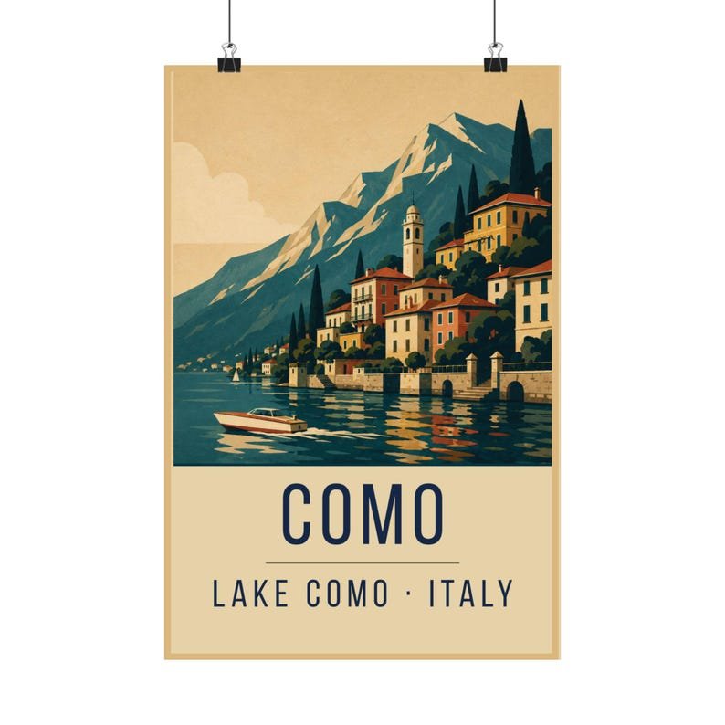
It sits naturally next to Lake Como and the Amalfi Coast as part of a southern-European set, all three sharing the same terracotta and cream.