The Douro splits the frame
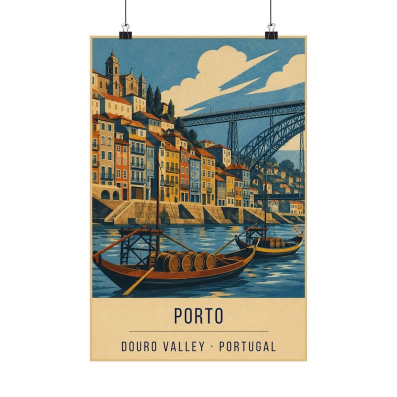
The Ribeira sits on one bank and the port lodges of Vila Nova de Gaia sit on the other, which means a poster of Porto has two towns in it whether you want them or not. The river between them is not empty space — it is the subject.
The print uses that split deliberately. The water occupies the centre band, the buildings press in from both sides, and the eye travels along the river rather than across the buildings.
Tiles, granite and rust
Porto is a city of surfaces: azulejo tiles, dark granite, painted plaster, and the rust-red ironwork of the Dom Luís bridge. Reduced to flat colour, those surfaces have to be suggested by tone rather than texture.
What survives the reduction is the stacking — house on house on house, each a slightly different value, climbing the bank. That vertical repetition is the thing people remember about the Ribeira, more than any individual building.
Where it works on a wall
A denser, more urban print than the coastal ones, and it holds up well in a room with books or dark wood where the lighter seaside prints can float.
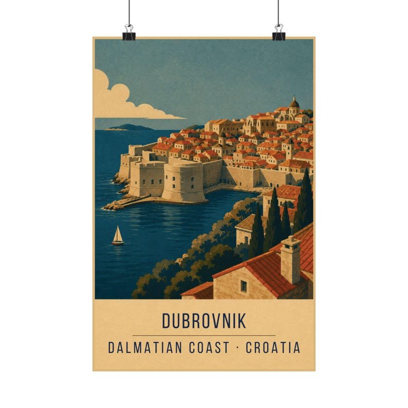
It pairs interestingly with Dubrovnik — two old European cities built in stone above water, one Atlantic and one Adriatic.