Two blues, not one
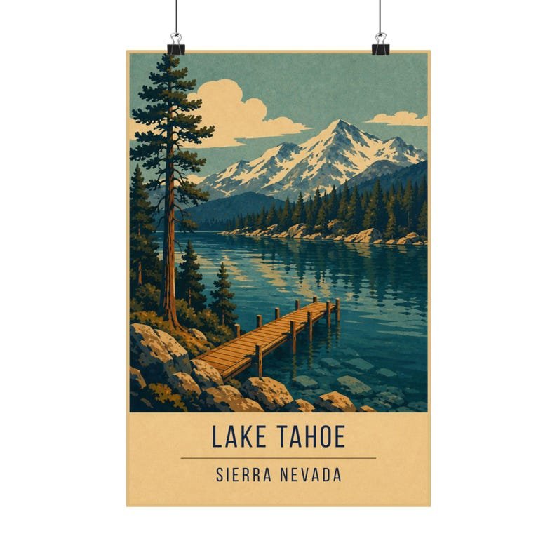
The solution is the same one the lake itself uses: depth. Tahoe shifts from a pale shallow rim to an almost black centre within a few metres of shore, and the print splits that into exactly two flat tones — teal at the edges, deep navy in the middle.
Because the boundary between them is a hard edge rather than a blend, the eye reads it as a shelf dropping away, which is precisely what it is. No gradient required.
Granite, pine and the treeline
The Sierra granite takes the cream, which keeps the peaks bright against the sky rather than turning them into grey mass. The pines are a single navy silhouette — individual trees are not the point, the treeline is.
The mustard appears only where the late sun catches the rock. Used sparingly like this, one warm accent in a cool print does more work than a whole warm palette would.
Where it works on a wall
A calm, cool print that suits bedrooms and offices, and holds up well in a room with a lot of natural light where warmer prints can wash out.
Hang it with Big Sur for a California set, or with Hallstatt for two very different mountain lakes.