Choosing the part for the whole
The solution the old Riviera posters used was to draw one village properly and let the coastline behind it imply the rest. A headland disappearing into haze does more work than four more villages rendered small.
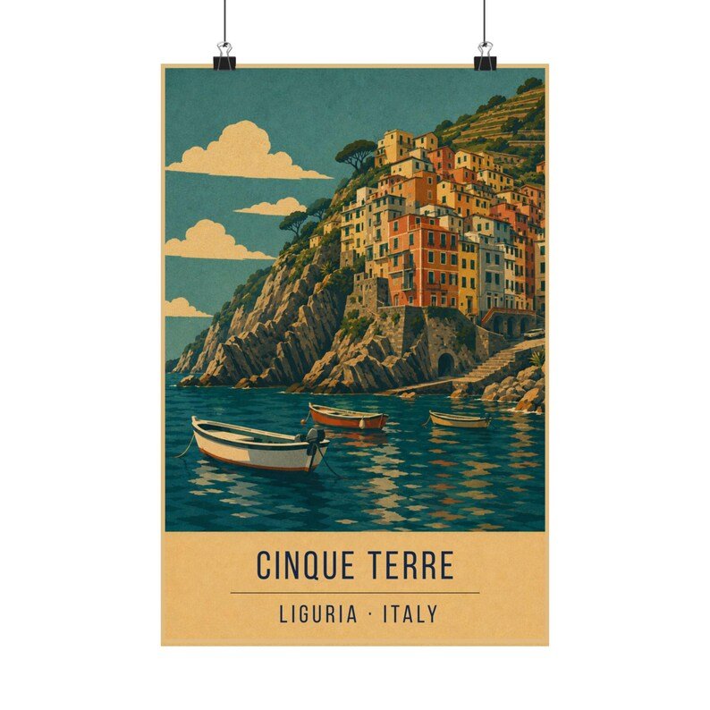
That is what this print does. The near village is fully drawn — houses, harbour, terraces — and the coast beyond it steps away in flattening tones until it stops being specific.
Terraces are the local geometry
What makes the Cinque Terre look like nowhere else is not the coloured houses, which the whole Ligurian coast has. It is the terracing: centuries of dry-stone walls cut into cliffs too steep to farm, holding vines above the sea.
The print keeps those lines visible rather than smoothing them into green hillside. They read as horizontal rhythm against the vertical stack of the houses, and they are the detail that stops the image from being generic Mediterranean.
Where it works on a wall
A busy print that rewards close viewing, so hang it somewhere people stand rather than pass — a hallway at eye level, or beside a desk.
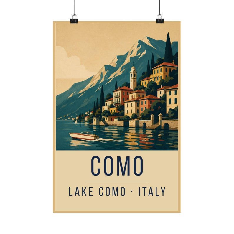
It sits well between Positano and Lake Como as part of an Italian set: riviera, coast and lake.