Standing in the street
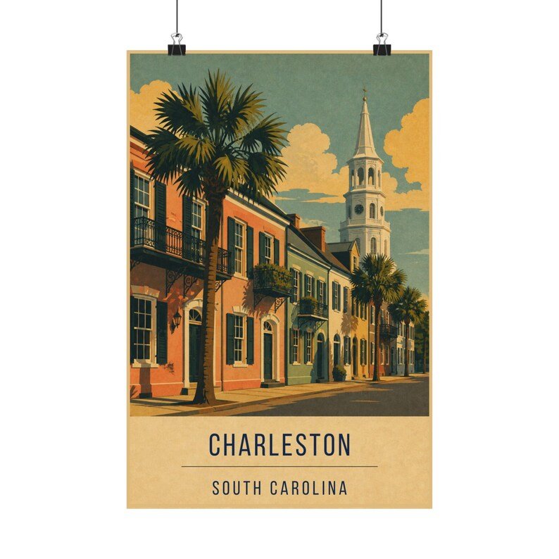
Charleston has no vantage point. There is no cliff to look down from and no harbour view that says Charleston rather than any other Atlantic port. The city is experienced at street level, walking, which is where the print puts you.
That means perspective has to do the work that geography does elsewhere. The row of houses recedes to the right, the pavement narrows, and St. Michael's steeple sits at the vanishing point to stop the eye.
Palmettos as vertical rhythm
A street of two-storey houses is a horizontal band, and a horizontal band alone makes a dull poster. The palmettos break it — regularly spaced, taller than the rooflines, throwing the eye upward at intervals.
They are also the fastest way to say South Carolina rather than New England. The same street with elms would read as Boston. This is the sort of shorthand travel posters have always relied on: one plant, one silhouette, one instant location.
Where it works on a wall
Because it is drawn at eye level, this print reads best hung at eye level too — lower than you would hang a landscape. It suits an entryway or a hallway where you meet it head on.
It is the only American city print in the collection; pair it with Big Sur or Lake Tahoe for a US set that runs coast to coast.