Selling nothing at all
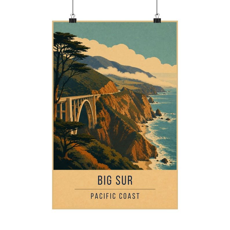
There is no town in this print, no harbour, no cathedral. Big Sur is a road, a cliff and an ocean, and the poster does not try to add anything. That is the WPA lesson: when the landscape is the product, the design should get out of its way.
What the poster does add is scale. The road is drawn thin and the cliff is drawn huge, so the eye reads the drop before it reads anything else.
Pacific fog in flat colour
The hardest thing about the California coast is the haze — the way distant headlands fade into each other. Flat colour cannot blur, so instead the print steps the headlands down through the palette: the nearest in navy, the next in teal, the furthest in a pale cream wash.
Stepped flat tones instead of a gradient is the oldest solution to atmospheric distance in screen printing, and it reads as fog the moment you stop looking for the trick.
Where it works on a wall
The strong horizontal of the coastline makes this print sit well above a desk or a sofa, where the eye is already travelling sideways.
It is the obvious companion to Lake Tahoe if you want a California pair — one coastal, one alpine, both in the same five inks.