Drawing a coastline, not a town
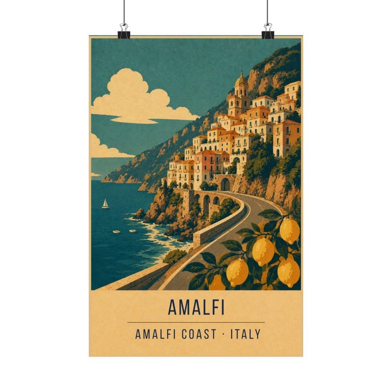
The temptation is to pick the most photogenic village and call it the coast. This print does the opposite: it pulls back far enough that the cliffs, the road and the sea are the subject, and the buildings become texture scattered along the slope.
That distance is what separates a regional poster from a town poster. The old Italian tourism boards printed both, and the coastal ones always sold the journey — the road, the drop, the promise of another town around the headland.
Keeping pastels out of the palette
The real Amalfi Coast is pastel — pinks, peaches, faded yellows — and pastels are exactly what a five-ink poster cannot do. Rather than fake them, the print translates the pastel range into its two warm inks and lets the cream stand in for everything lighter.
The result is bolder than the real thing, which is correct. A travel poster was never a document; it was an advertisement that had to work from across a station.
Where it works on a wall
A wide, warm print that works best on its own as a single statement piece over a bed or a mantel.
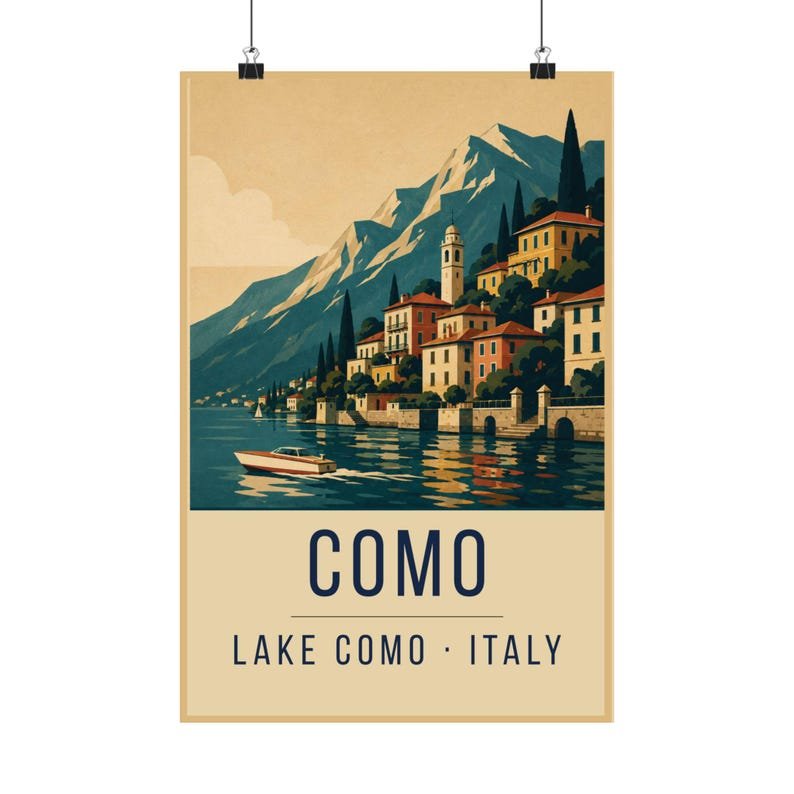
For a pair, hang it with Positano — the coast at a distance next to one town up close — or with Lake Como for warm coastal against cool alpine.